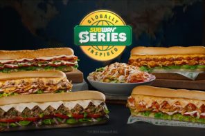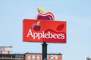
Studies have shown that consumers make the decision of whether or not to buy something in the first 90 seconds, and 60 to 90 per cent of this decision is solely based on colour. There is a science behind the choice of colour used for every great QSR company’s logo, and the primary or most popular colour is yellow. McDonald’s, Burger King, Pizza Hutt, Subway, In-n-Out Burger, Carls Jr and Wendy’s all use a pop of yellow in their logos. The reason for the use of colour is because it is commonly associated with feelings of comfort and reliability for consumers. Fast Food is a quick and predictable option for consumers to turn towards which makes yellow the ideal colour for fast food operators to associate their brand with. The eye-catching colour also stands out amongst a crowd. The perfect colour pair to optimise a company’s brand awareness is, however, the combination of yellow and red, which the majority (all but one) of the above fast food chains use. According to Nikki Hesford, marketing adviser and founder of Business Academy; “Colour plays a leading role in how people subconsciously process them. Whether they are aware of it or not, colours have connotations and consumers make immediate judgements based on that.” The theory behind the science is aptly called the ketchup and Mustard theory.
BEHIND THE SYMBOL