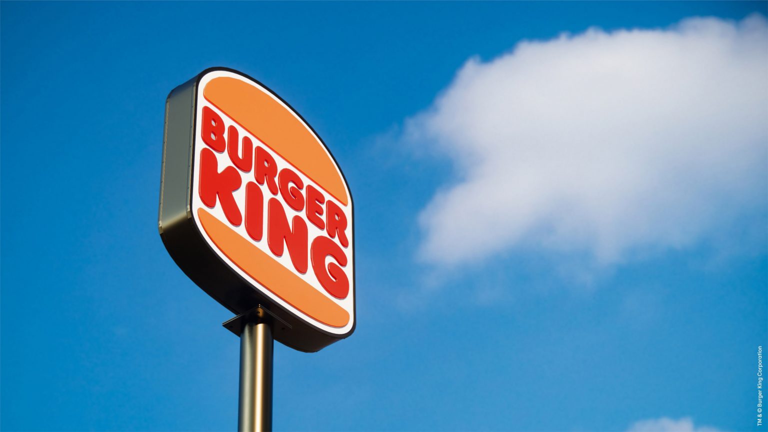
Popular burger chain, Burger King has re-branded for the first time in 20 years. The new look focuses on the restaurant’s food and its past with its font and colours recreating a retro vibe.
The redesign, spearheaded by designer Lisa Smith, executive director at Hones Knowles Ritchie has included the creation of a logo that closely resembles the logo used by the brand in the 1970s, 80s and 90s.
"We explored a lot of different design territories but kept coming back to the brand's original iconic logo from 1969 and 1994 when Burger King looked at its best," explained Smith.
"We were inspired by how it has grown to have such an iconic place in culture – from Back to the Future, Gremlins through to more recently Stranger Things and BK’s Warhol campaign," she continued. "The new logo pays homage to the brand's heritage with a refined design that's confident, simple and fun."

The new logo (right) directly refers to the previous logo (left) and replaces the logo introduced in 1999 (centre)
The revamped logo replaces the previous design introduced in 1999, which was made up of a more stylised burger surrounded by a blue crescent. According to Smith removing the artificial-looking blue swish was a reference to improvements in the brand's food.
"Our choice to remove the colour blue was somewhat symbolic of Burger King's recent removal of colours, flavours, and preservatives from artificial sources," she explained.
As with most major brands, Burger King has a strong digital presence and the rebrand was designed to work across multiple digital platforms. As part of the digital overhaul, Burger King will be using a new favicon that turns the letters B and K into a burger on its app and some other online platforms.
![]()
Burger King will start rolling out its rebrand immediately and is aiming to overhaul all of its restaurants over the next few years.


