

Soon to be launched worldwide, McDonald’s has unveiled new packaging designs created by Pearlfisher.
The fast-food giant seems to have followed Burger King’s lead with the creative agency making use of simple yet bold graphics to illustrate the signature menu.
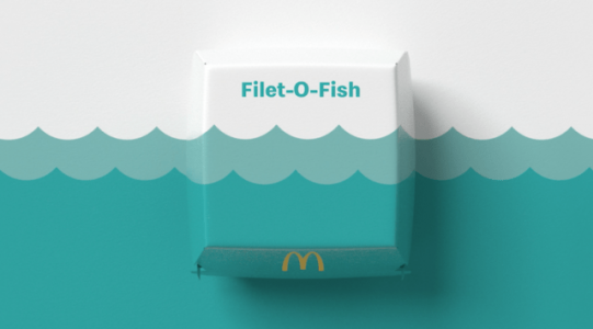
Described by Pearlfisher as a bold graphics system that aims to "bring a sense of joy and ease", the design served to simplify and modernise the packaging of the fast-food company’s boxed and wrapped products.
BK's new logo (right) directly refers to the previous logo (left) and replaces the logo introduced in 1999 (centre)
“Our task was finding out what was really special about each menu item to design a system that would make it easy for others to do the same,” Matt Sia, creative director at Pearlfisher, said.
“There’s beauty in the simplicity of McDonald’s’ iconic menu items. We aimed to find the most special, recognisable and iconic expression of each – celebrating them in a way that makes people smile.”

News of the new design was revealed by Pearlfisher to various online design magazines, including Designboom, the UK’s Creative Review, Designweek and Creative Bloq.